Background brief
As of 2016, legal professionals encountered substantial obstacles in their efforts to network with other attorneys for referrals, knowledge exchange, and collaborative opportunities. Lacking a dedicated, trustworthy platform for professional connections, they often found themselves lost in time-consuming searches that seldom produced beneficial outcomes.
This inefficiency resulted in missed referral opportunities and significantly impeded the growth and expansion of small legal firms, highlighting a critical gap in the legal industry's networking infrastructure.
Research objectives
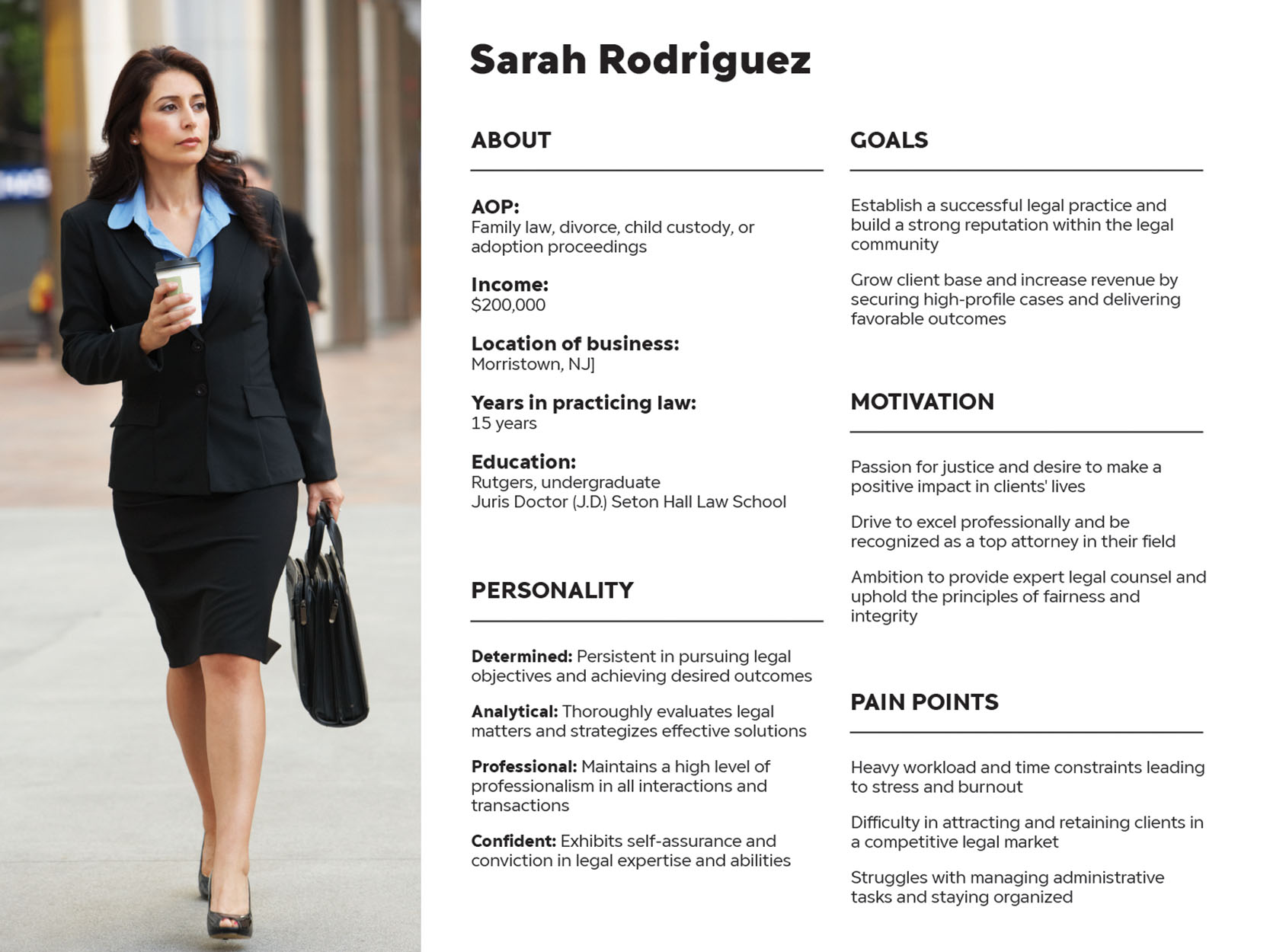
To understand the needs and preferences of attorneys aged 28-55 regarding legal professional networking services.
To identify and validate different user types within the legal professional community.
To analyze user flow behaviors to improve the usability and efficiency of a legal networking platform.
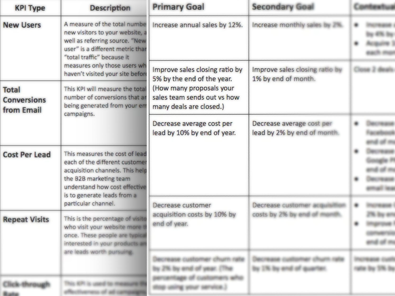
Key findings
Summarization of the top three findings from research and analytics
Users were confused on benefits from Martindale's legal entities.
Advanced search is confusing and delivers inaccurate results.
49% of users are not in legal profession, rather seeking legal advice.

Problem(s)
Users are struggling to understand the specific advantages that Martindale's legal entities provide, leading to confusion and potential underutilization of available services.
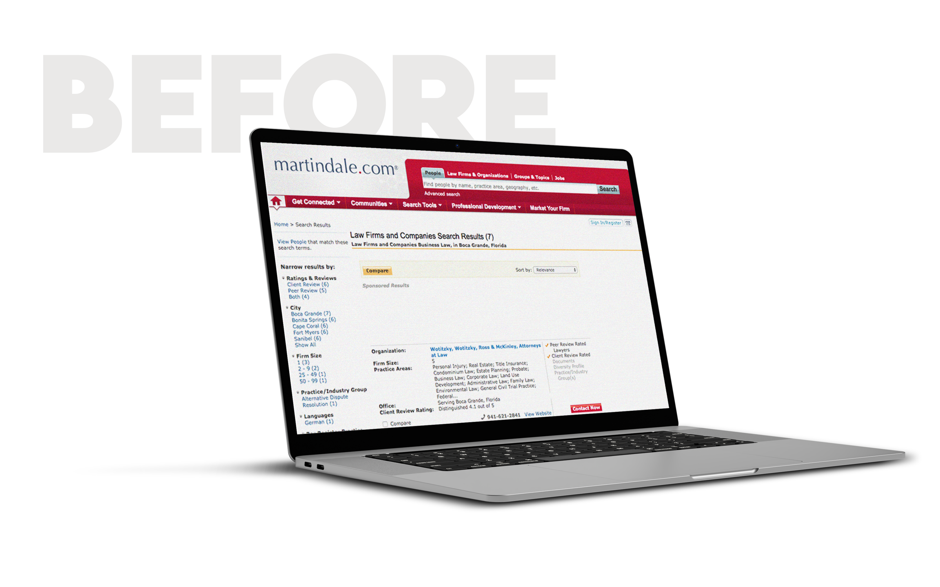
The complexity and inefficiency of the wayfinding and advanced search features on the platform are causing users to experience confusion and receive inaccurate search results, hindering their ability to find the information or services they need effectively.
Almost half of the users (49%) on a platform designed primarily for B2B interactions are individuals seeking legal advice rather than legal professionals. This discrepancy highlights the necessity to refine the platform's messaging, services, and offerings to more exclusively target and serve a B2B audience.
Hypothesis
By refining the clarity of Martindale's legal entities' advantages, streamlining the wayfinding and search functionality, and adjusting the platform's focus to more explicitly target B2B interactions, we hypothesize that we will reduce user confusion, enhance the accuracy of search results, and align our user base more closely with our intended B2B audience, thereby improving overall service utilization and satisfaction.
How might we
How might we better explain Martindale's legal entities' benefits to decrease user confusion and increase service usage?
How might we enhance the wayfinding and search features for more accurate results and less user confusion?
How might we adapt our platform to cater to only B2B audiences?
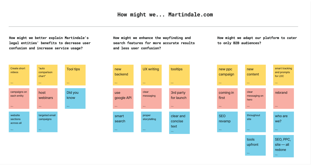
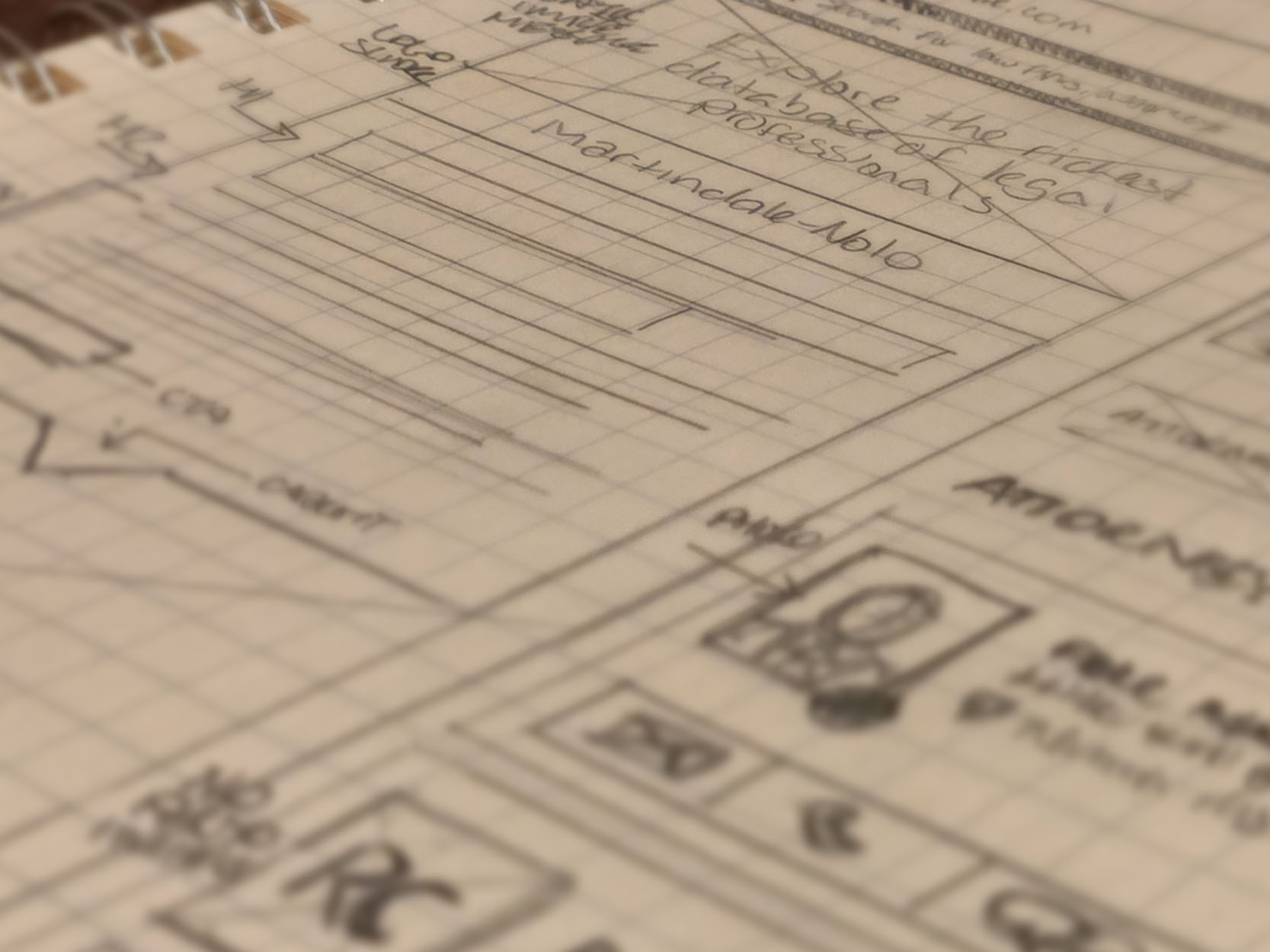
Crazy 8's ideation
Collaborating with team members, product developers, engineers, and stakeholders, we adopted the 'How Might We' (HMW) process and Crazy 8 technique for rapid idea generation. Aiming for 8 innovative solutions in 8 minutes for each HMW question, participants then shared their concepts. This method yielded 12-16 practical sketches, crucial for outlining a comprehensive feature list.

Key features
- Enhanced search algorithm
- B2B audience targeting
- "Amazon" responsive filters
- Dynamic FAQ section
- B2B personalized news
- Webinars and workshops
- Advanced analytics and reporting
- Fully optimized responsive mobile — desktop
- Client feedback and satisfaction tracking
Design Principles
Streamline User Interactions: Design every element to minimize effort and time from the user's perspective, ensuring that common tasks can be completed with maximum efficiency and minimal friction.
Intuitive Navigation: Implement a clear, logical navigation structure that guides users through the platform effortlessly, using familiar patterns and visual cues to reduce confusion and enhance discoverability.
Tailored Content for B2B Lawyers: Present legal concepts in clear, concise language with industry-specific visuals. Use legal terminology appropriately to ensure quick comprehension and professional integrity, streamlining information access for B2B lawyers.
Solutions
What we did
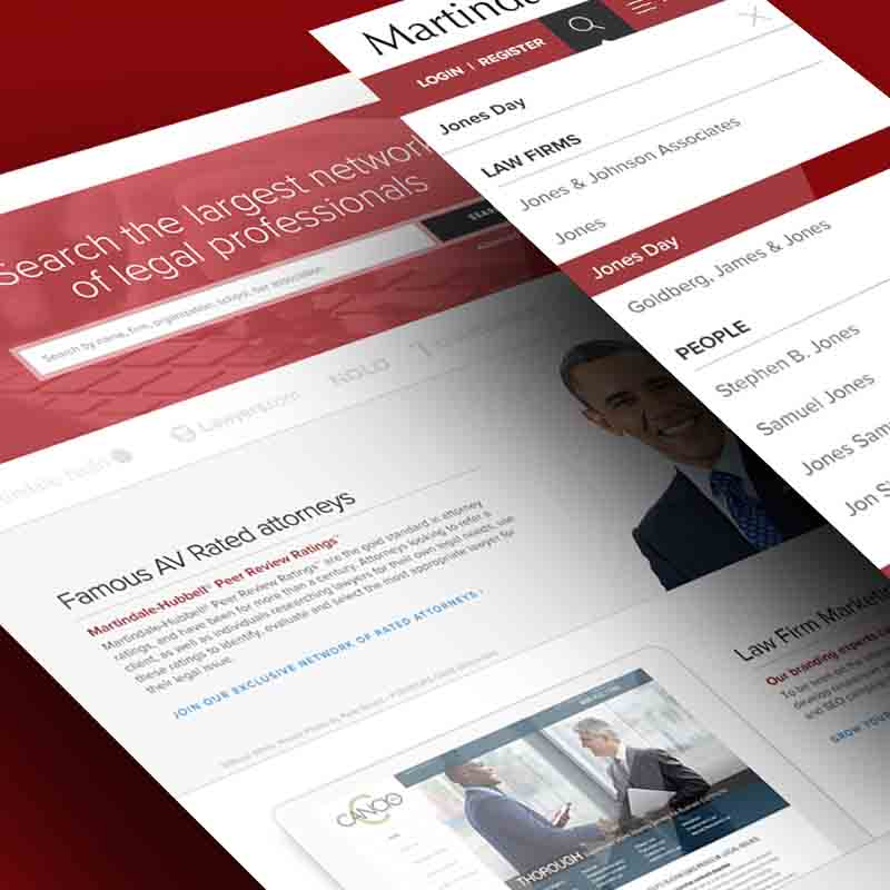
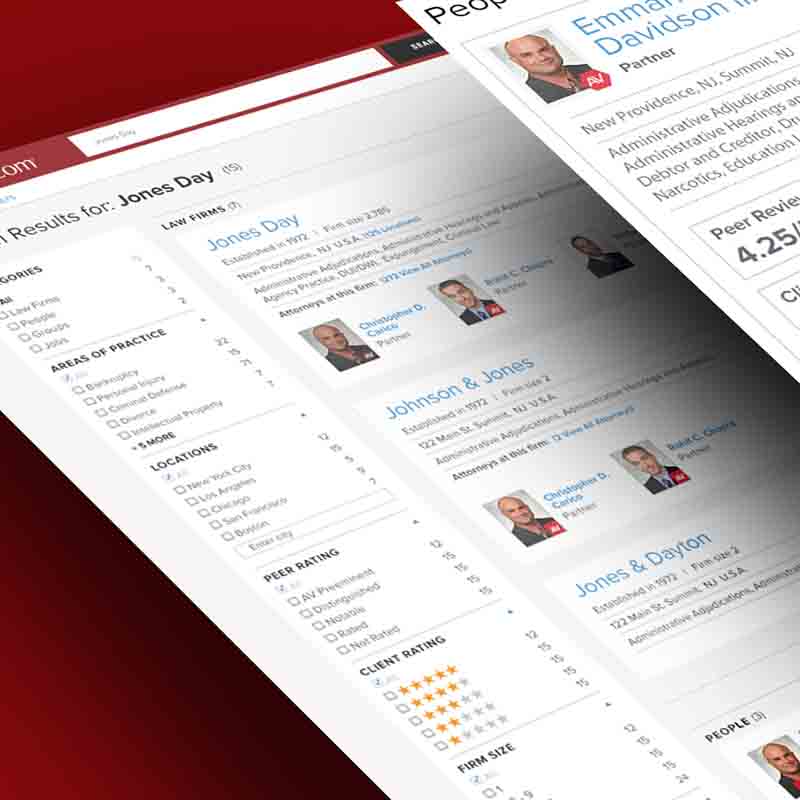
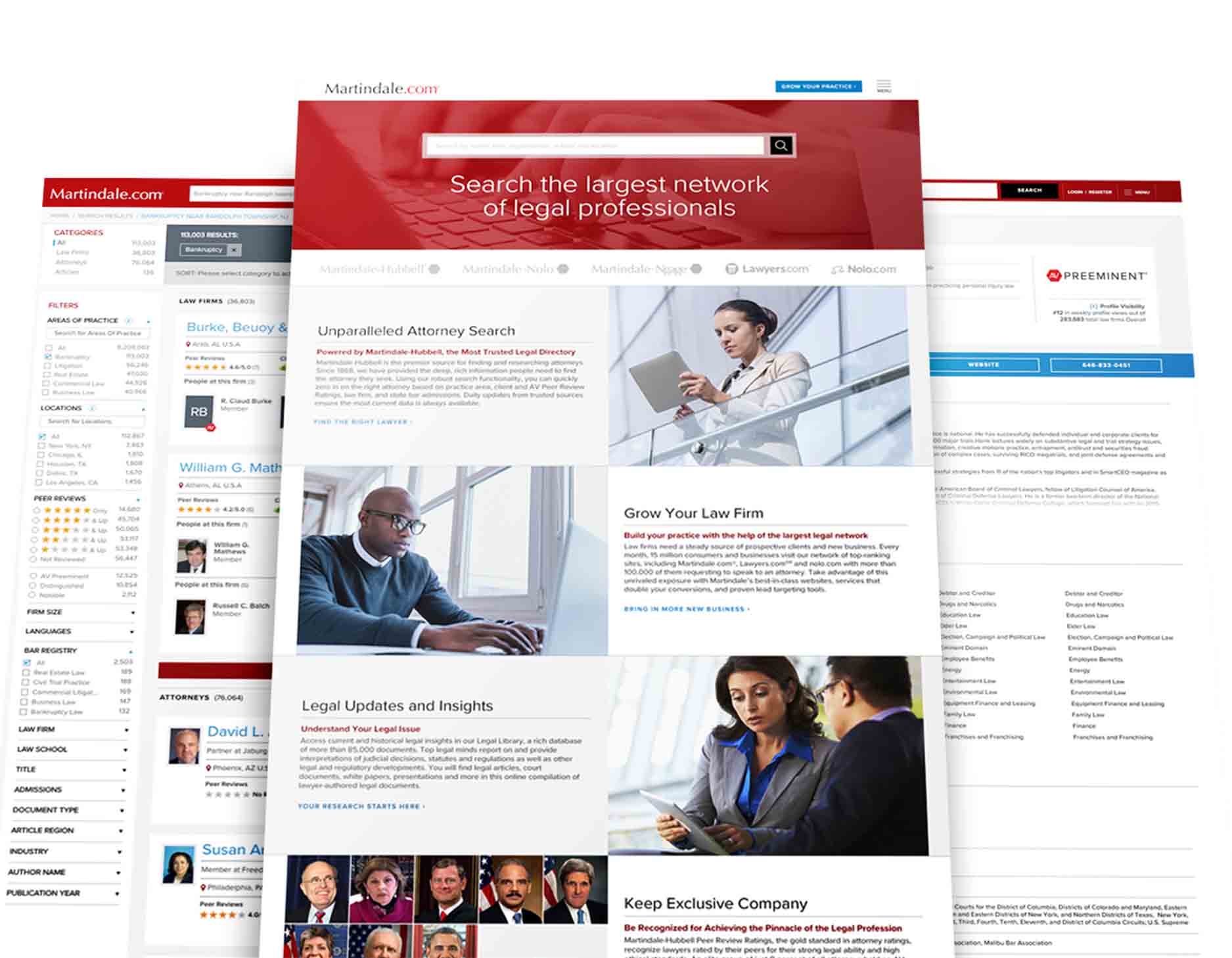
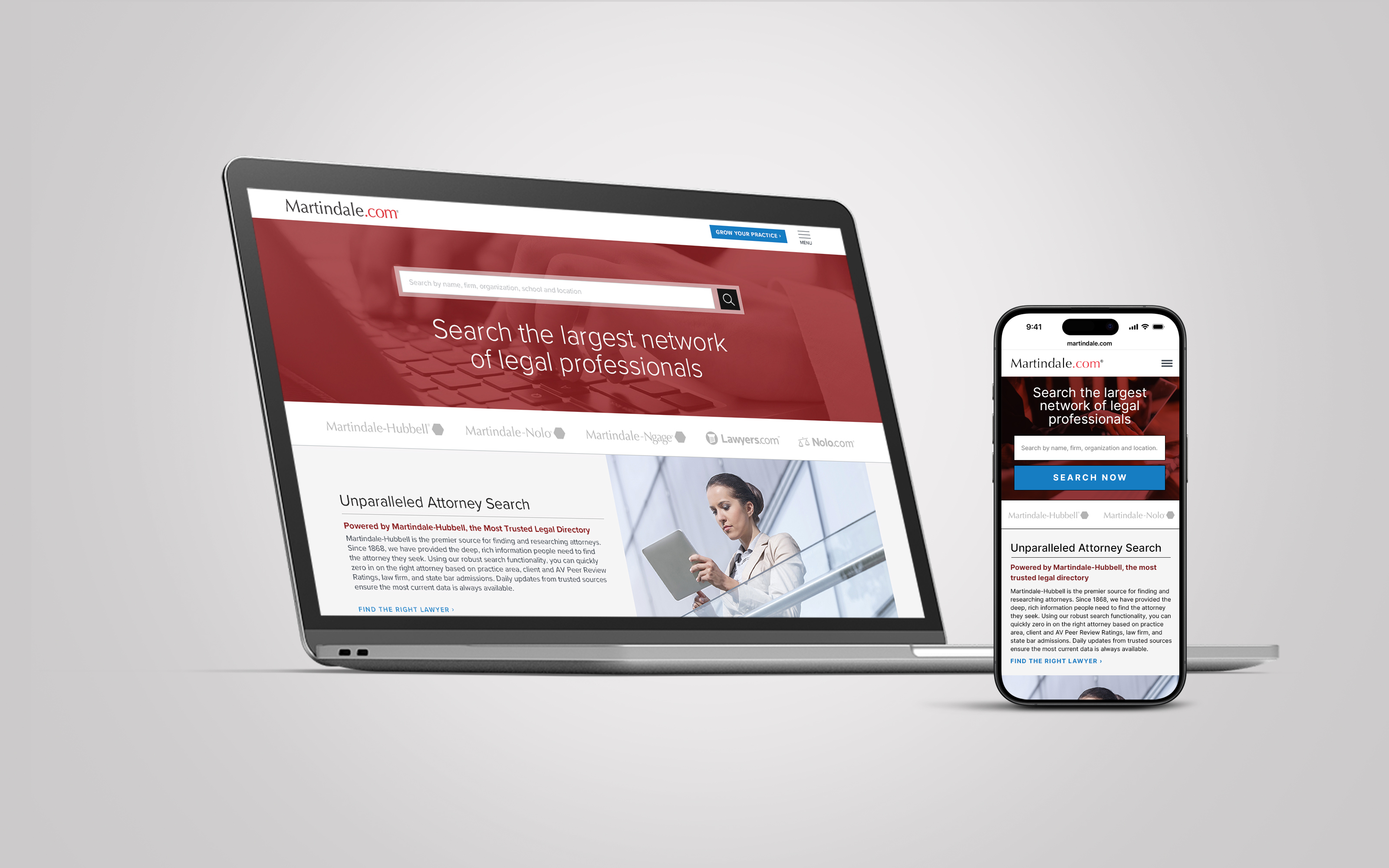
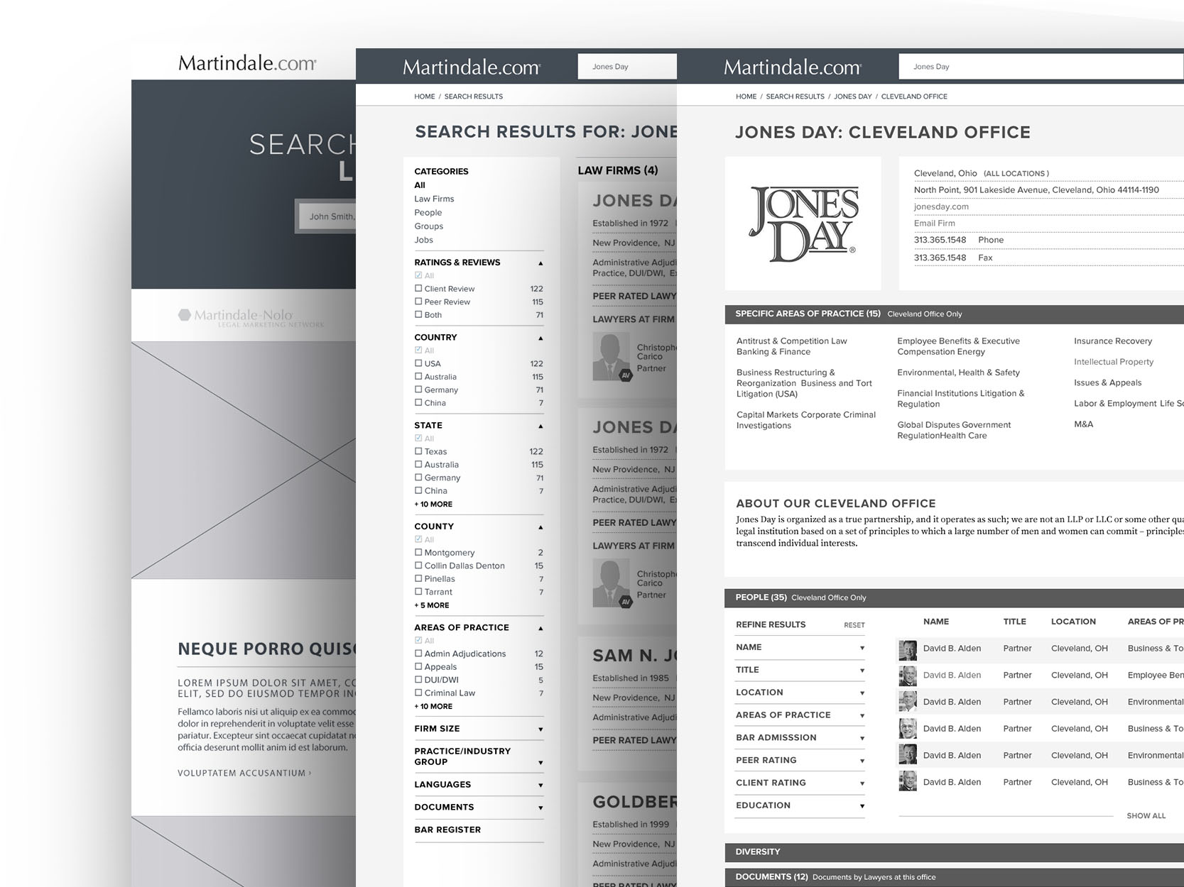
To improve efficiency in searching, connecting, referring, and interacting among legal professionals, a major update to the backend service was essential. This update introduced a fast, accurate search function tailored to user habits and expectations, ensuring a smooth experience.
The updated service features redesigned profile cards displaying key details like name, title, practice area, location, photo, and ratings succinctly. The algorithm prioritizes relevant members by practice area and location, ensuring the most appropriate profiles are displayed first. Non-members are shown in a separate interface, making it easier for users to find the right attorney quickly and highlighting the benefits of membership.
Results
What went well
User satisfaction
Membership client satisfaction increased from 65% to 90%.
SaaS subscriptions
Exceeded conversion KPIs, jumping from 10% to over 22% in the first year.
Internal mindset change
The project's success and its impressive results have led to a paradigm shift in our approach to product development moving forward.
What didn't go well
Too many features
We were overly ambitious with our initial MVP, incorporating too many features, which later required prioritization and phasing out.
Underestimated time and complexity
We significantly underestimated the complexity of some features. Despite operating in an Agile(ish) environment, a replanning was necessary to address these challenges.
Non-members profile
Initial feedback from non-members indicated that their profile cards were perceived as significantly less appealing and often not seen until many pages into the search results.